

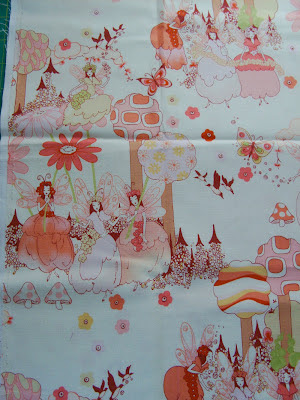
This is the theme fabric for the quilt.
I’m using it for color cues as well inspiration for the design.

The middle will be a panel made up of two trees that echo the design of the ones on the theme fabric. I’m thinking about using a solid burgundy fabric to make a bias applique edge around the trees to highlight them like on the theme fabric. {I’m a little nervous about this idea!}
The
panel will be bordered on all sides by my Joy Framed block, some with
an appliqued daisy and the remaining blocks with the theme fabric fussy
cut in the centers.

Idea #1
First I was thinking to make the whole quilt have a background. I was going to use this Denyse Schmidt dot fabric as the panel background and behind the applique daisies.
I was really trying to think of a modern, stream-lined look for the quilt. Not too many fabrics, large scale geometrics and solids.
I thought about using the fat quarters we already have in the corners of the Joy Framed blocks and the Denyse Schmidt dots as the background.
Idea #2
Then I thought the dots might look too busy behind the trees – take away from them as the middle of the panel. I did a little bit of number scribbling and figured out I could use 7 fat quarters to make enough 6 inch squares to build the background of the panel. Then I would use the dot fabric in the background of the Joy Framed blocks – basically switch the design around.
A traditional quilt.
What does she mean by traditional? Scrappy!
Lots of different fabrics.
Blocks made up of lots of pieces.
The Current Idea!
Buy more fat quarters! LOL!
The plan now is to make the background AND the corner squares out of fat quarters.
I’m planning to make the stars of the Joy Framed blocks all in solid colors – and that might change to just one or two colors.
My daughter also wants LOTS of the lime green. I think the quilt is starting to look like a pink quilt. Not a bad thing, but – it’s definitely different from a lime green quilt. I’m trying to remedy this situation by using some lime green prints on the back. And the applique daisy block centers will probably be lime green too – Kona Solid Zucchini green to be exact!

Oh, and the large rectangle beneath the trees on the panel will be the Amy Butler lime green print. The little triangles are for Prairie Points to make the grass look 3D – another request from my daughter.
- more blue
- an applique butterfly on the panel similar to the ones in the theme fabric
Sarah Vee